
Google Chrome
Staff Product Designer • 2013—2020
I started working on Chrome as designer number ~5, shortly after it took over majority marketshare. Over seven years, I contributed across the Chrome ecosystem, focusing primarily on the Android browser and productivity and shopping use cases.
Tab Groups on Mobile
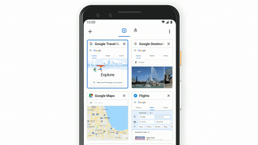
Most people use mobile browsers for quick tasks, saving complex activities like trip planning or comparison shopping for desktops. I led an initiative to challenge this assumption and push the boundaries of what's possible on a mobile device.
Our research identified key elements of complex tasks:
- The need to assemble and compare multiple pages
- The need to save and resume tasks over multiple sessions
After experimenting with various prototypes, I developed our tab groups solution. It allows users to assembles groups of tabs and resurface them together - and then quickly swap between tabs within a group.
Tab Groups on Desktop
This is probably my most ubiquitous contribution to software so far.
Tab groups help multitasking users identify tabs within active tasks quicker and ignore those tabs that represent inactive tasks. The challenge was to help advanced users without complicating the experience for everyone else.
I inherited this project from several other designers and was responsible for defining the final UI details that launched. Designing a UI that would be constantly present for a massive audience required attention to detail. The UI needed to be visible enough to do its job while not being distracting. It also needed to have clear contrast against the many Chrome toolbar styles, including customizable colors, image backgrounds, and dark mode.
After several explorations, I arrived at the "colored tag and underline" solution that now graces many users' tab strips.

Chrome Home
At Chrome, I specialized in conceptualizing and prototyping experimental features, including some that never launched—like Chrome Home.
Chrome Home aimed to enhance the mobile experience by relocating the toolbar to the bottom of the screen, transforming it into a peeking panel with additional controls.
I pitched the concept in 2016. I saw an opportunity to solve two problems at once:
- Phones were growing larger, creating a need for a gestural, one-handed interface.
- Mobile Chrome's minimalist design hid many features behind a "three dot" menu, making them underutilized and hard to access.
The idea gained traction and became a Chrome org priority. I led the team in executing on the concept, which involved rethinking every single part of Chrome's UI over several rounds of prototyping and research.
Chrome has over a billion users, and their feedback varied widely. While tech enthusiasts appreciated the innovation and efficiency gains, others found the new layout confusing and disorienting. After extensive feedback and iterations, I became increasingly convinced that launching Chrome Home would not meet the needs of our diverse user base effectively.
So, just as I strongly as I had pitched the original concept, I advocated for us to stop the launch—which as, you can imagine, required considerable internal debate. Chrome Home remains a valuable lesson in balancing bold innovation with user needs and product scale.
While Chrome Home never made its way into Chrome, since 2021, several mobile adopted a similar UI.